Components
Components
Every piece of the system, live, in both themes. Each preview is the real component — never an illustration of it.
Application
AppThe root: theme stamp, title template, skip link and the toast outlet, mounted once.
Open AppForms & input
ButtonEvery clickable commitment. Picks the right element for the job.
Open ButtonForm & validationA real form, rules as functions, and focus on the first failure.
Open Form & validationFieldLabel, control, hint, error — wired together.
Open FieldForm controlsInput, textarea and the native select.
Open Form controlsSelectionCheckbox, radio, switch — each for its own kind of choice.
Open SelectionSlider & uploadThe checker's sliders, and the survey-plan dropzone.
Open Slider & uploadCode entryThe six-box confirmation code.
Open Code entryContent & data
CardsSix variants, a horizontal form, and the specimen card.
Open Cards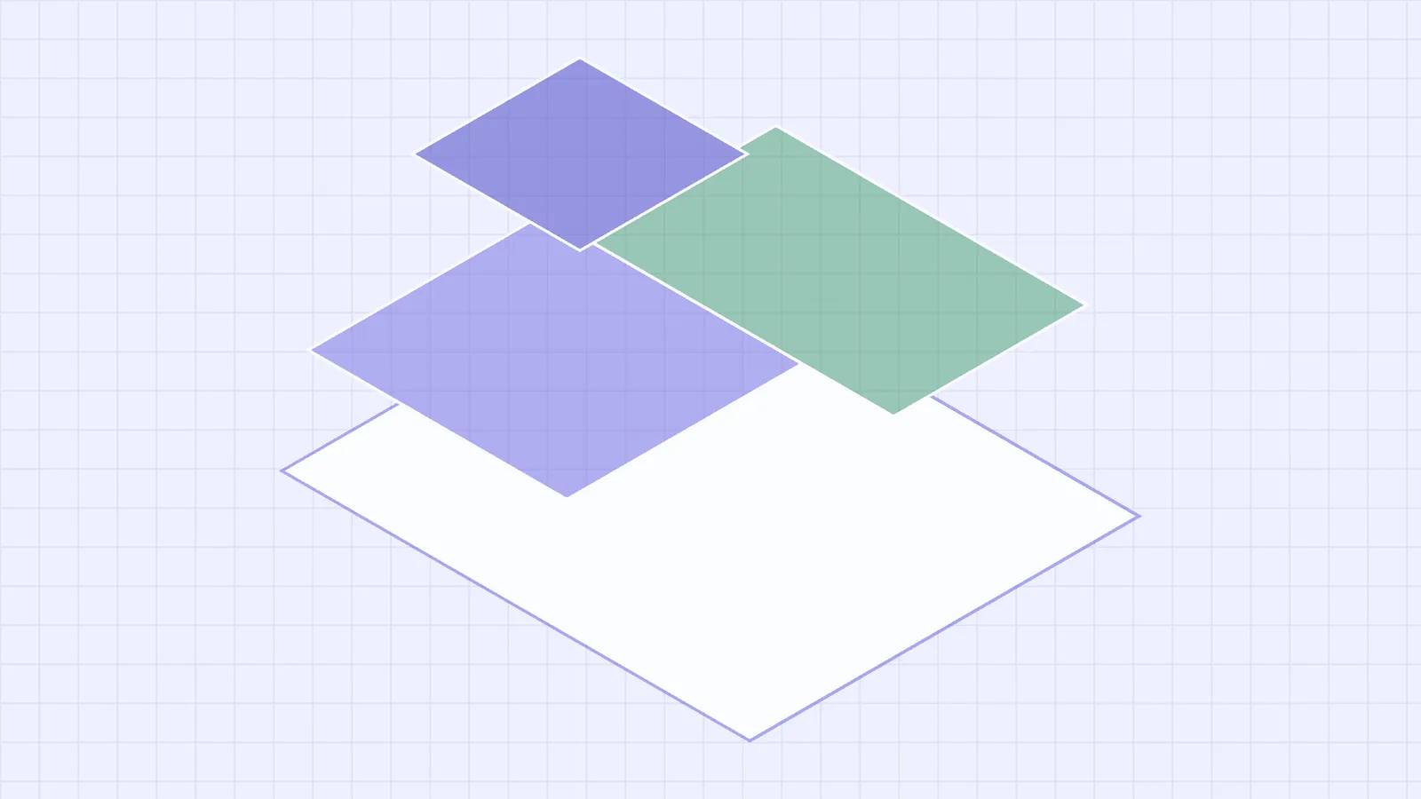
Image & figureA reserved box, a caption, and the survey grid underneath.
Open Image & figureKey figuresNamed figures, mono on a shared right edge so they compare without counting digits.
Open Key figuresLog streamRaw machine output: fixed-width, tone per line, follows the tail.
Open Log streamPipelineStages on the cadastral canvas, joined by cables that show where data is moving.
Open PipelineActivity feedThe audit timeline: a sentence and a mono timestamp.
Open Activity feedList rowThe workhorse: one of many, scanned.
Open List rowSortable listDrag to reorder, with a keyboard path that does the same.
Open Sortable listSectionA titled block of a page, with an optional sub.
Open SectionData tableToolbar, sortable header, selection, pagination.
Open Data tableTreeHierarchy you can walk with the arrow keys — depth is information.
Open TreeChip & badgeOne labelled fact; one count.
Open Chip & badgeCode blockSamples on the dark ground, in both themes.
Open Code blockMessaging
Alert & calloutA live condition of the data; the author's aside.
Open Alert & calloutBanner & toastA condition of the view; a confirmation that leaves.
Open Banner & toastStatus & progress
Progress & loadingSpinner, skeleton, progress — and avatar, kbd, inline code.
Open Progress & loadingStepperA short ordered sequence you must finish. Not a progress bar.
Open StepperDisclosure
AccordionStacked disclosures for a rulebook. Not exclusive, on purpose.
Open AccordionTabs & segmentedDifferent content; the same content, differently.
Open Tabs & segmentedOverlays
DialogDecisions with consequences, on the native element.
Open DialogDrawerA full-height side sheet over a scrim.
Open DrawerPanelThe non-modal surface docked beside a live map.
Open PanelPopover & tooltipAnchored explanation; a name on hover and focus.
Open Popover & tooltipMenuCommands on a trigger, with the full keyboard contract.
Open MenuPlanning & map
Approval stackWho has to say yes, in icons and words.
Open Approval stackMap tools & searchThe floating chrome, the scale bar, and the omnisearch.
Open Map tools & searchBrand
LogoThe surveyed lot — one plane left empty.
Open LogoSurvey gridThe brand's ground texture — one pitch, three faces.
Open Survey gridTheme toggleLight, dark or follow the system — and the head script it needs.
Open Theme toggle